
The Scatter Chart Widget
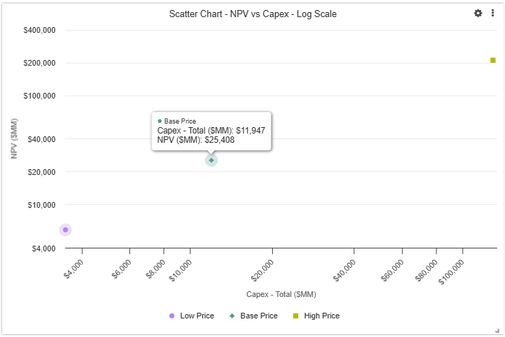
A scatter chart plots two metrics against each other — one on the x-axis and one on the y-axis — to reveal relationships or patterns across opportunities or scenarios. See Widgets Overview for information about how to add each widget and additional options.
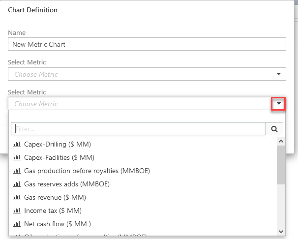
Configure a Scatter Chart Widget
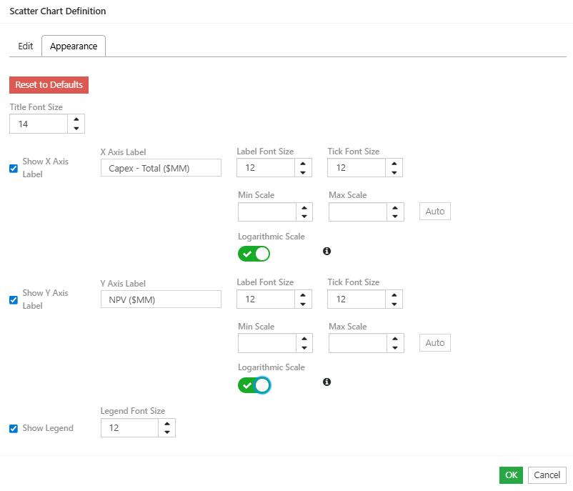
- When you add or hover over an existing scatter chart, the Edit and Appearance options will appear in the Scatter Chart Definition dialog.
- Enter the name for the chart in the Name field.
- Choose metrics to plot on the X and Y axes.
- In the Appearance tab, you can label your axes, customize font sizes for title, axis labels and legend, enforce a scale, and choose logarithmic if desired.
- Click OK to create the chart.
- Resize and reposition the widget, as required.
Click image to expand or minimize.
Click image to expand or minimize.
Click image to expand or minimize.
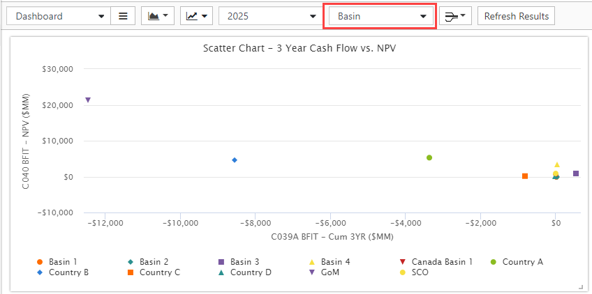
Dashboard Display Options
- Use the Group control on the Dashboard to display a scatter chart for the metrics per-group value.
- Use the Time filter control on the dashboard to summarize series metrics. 'All' is the series total, otherwise summarize to the selected date. Scalar metrics are not affected.
Click image to expand or minimize.